Welcome

Versions Compared

Key

  • This line was added.
  • This line was removed.
  • Formatting was changed.

Anchor
TOP
TOP
Include Page
CP Script
CP Script

Table of Contents
maxLevel3
exclude1//2//3//4//5//
stylenone

Include Page
CP AF Illustrations and changes

This page explains the basic functionalities and common elements for all application forms.

Note
titleTake note

When filling in the application form, go through the sections in the order in which they are listed in the Content menu (from top to bottom), as the information provided in one section often affects fields in a later section.

The form content will adapt based on your input and will provide feedback such as warning messages or error messages if information is missing or eligibility rules are not observed. 

There are detailed onscreen instructions, notifications and warning messages specific to the form you are working on. In addition, certain fields have explanations which you can read by moving your cursor on the field title. Please read this information carefully and if you require further assistance, consult the content related to the specific application form action. 

HTML
<div class="page-break-ruler">&nbsp;</div> 
Numbered Headings
start-numbering-ath2

Application Details screen layout

After you click Apply for the desired opportunity the Application details screen opens. The following elements are available for all forms:

  1. Header

    • Basic information on the call and your application form is displayed at the top of the work area.
  2. Content menu

    • Allows you to navigate to the various sections in the form. The available sections vary, depending on the Action you apply for. 
    • Initially all sections display a red X. When a section has been correctly completed, the icon changes to a green check. 
    • Sections containing subsections can be opened by clicking on the arrow > on the right
    • The buttons All and Red marks on top of the Content menu can be used to show all sections for the form or only the incomplete ones, meaning the ones with the red x. 
  3. Content area 
    • Includes the content of the form that you will fill in. In the below example, the Content area displays the Participating organisations section of the form.e
    • Click on the information icon next to the title of the content area view additional information of the section. 
    • Next/previous section buttons: to access the next or previous section of the form.
    • Full screen button: will open the currently selected section in full screen mode.
  4. PDF button
    • Click on the button to export the application form to a PDF file.

 Application Details screenImage RemovedApplication Details screenImage Added

Anchor
header
header

HTML
<div class="page-break-ruler">&nbsp;</div> 

Header

The header in the work area of the application forms displays basic information about your form. By default, it only shows key details. Click on the arrow to expand and view further information.

Information displayed in the header:

  1. Form ID - Unique identifier of your application form
  2. General information on the selected application form: Programme, Round, Call and Action type
  3. Status of the form (e.g. draft, submitted) and Submission deadline
  4. Detailed information such as Application owner, Application creator, creation and last modification dates, sharing information, and a progress bar indicating the completion percentage of the form.

Application Form HeaderImage RemovedApplication Form HeaderImage Added

Anchor
navi
navi

HTML
<div class="page-break-ruler">&nbsp;</div> 

Navigation through/within application sections

Content menu

To access a specific section, use the Content menu. The content menu also allows to easily check the progress of the completion of the sections and subsections of the application form.

The sections in the Content menu should be completed in sequence.

  1. It is possible to collapse the Content menu using the dedicated arrows (<), in order to expand the content area.
  2. The All button on top of the content menu is selected by default, displaying all available sections of the form. Click on the Red marks button to display only sections that are incomplete.
  3. Initially, all sections in the content menu display a red X. When all sections (and subsections) are complete (all mandatory fields have been correctly filled in) a green check displays. 
  4. Sections containing subsections display an arrow > to the right of the section name. 
  5. Numbers in a blue circle next to a section name indicate the number of included elements, for example in section Annexes.
  6. The sections Sharing, which allows the sharing of an application form, and History, which contains the Submission history for the application, do not display the red X or green check. 

Here are two examples of the Content menu for a KA131-HED - Mobility of higher education students and staff application form. The first image shows the content menu with all available sections where the Context section is marked as complete. The second image shows the content menu only displaying the incomplete sections and the Participating organisations section expanded to display the available subsection(s). 

 Content MenuImage RemovedContent MenuImage Added 

Alternatively you can use the previous/next buttons in the content area to navigate through the various sections and subsections in the application form. 

Image RemovedImage Added

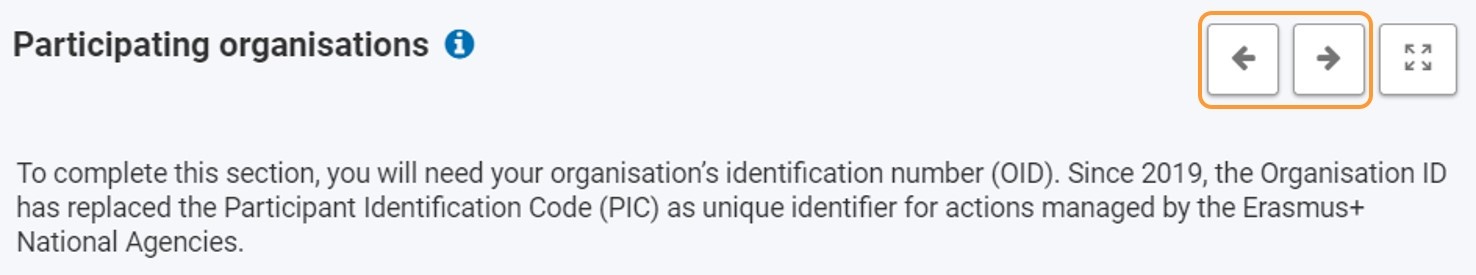
You can also use the Full Screen button in the content area to maximise the information you see on screen. The main menu and Content menu will no longer be visible. 
You can still navigate through the sections and subsections of the form by using the previous/next buttons.

To revert to normal view, click on the Exit full screen button.

Image RemovedImage Added


Anchor
subsection
subsection


Subsections in the Content menu

Note

The previously used navigation tree has been replaced by Subsections in the Content menuThis may not yet be reflected in text and screenshots on all detailed documentation pages.

Subsections are available for certain sections by default or are added dynamically when you add elements, such as organisations, to your application form.

Click on the available arrow > next to the section title to see the available subsections to complete. The title of a subsection can change to reflect the name of the element it refers to, such as an organisation name, to distinguish between different subsections of the same type within a section.

You can select any subsection directly by selecting it from the Content Menu or by using the previous/next arrows in the Content area.

The completion of a subsection is indicated by a dot. A red dot displays for incomplete subsections and a green dot for completed subsections. 

Subsections in Content menuImage RemovedSubsections in Content menuImage Added


HTML
<div class="page-break-ruler">&nbsp;</div> 

 Types of fields

Below are the most frequently encountered types of fields (the list is not exhaustive):

Text fields

  • Text fields are basic fields where you can type your answers to the questions in the form. Text fields may have a character limit. The maximum number of characters that can be used for a specific answer is indicated in the top right corner of the text box. It is not compulsory to use the maximum allowed number of characters. The character limit will count down automatically when you start filling information. If the maximum number of characters has been used, a red 0 is displayed. No more text can be added.

Text fieldsImage RemovedText fieldsImage Added

Filling text fields in languages other than English

If you have selected to fill in your form in a language different from English, certain text fields need to be filled in both in the selected language and in English.

In our example, the Consortium summary is required in both the foreign language and English in a KA130-HED application form.


Forms in other languagesImage RemovedForms in other languagesImage Added

Drop-down lists

  • Simple Drop-down lists are used where the user must select a single item from a list of predefined options.
    • In the following illustration there are two examples of simple drop-down lists. In the left one, click on the arrow in the drop-down field to change your selection. In the right one, first click on the X to remove the current selection, then click in the drop-down field again to select a different item.

Simple drop-down listsImage RemovedSimple drop-down listsImage Added

  • Multiple-choice drop-down lists - are used where the user can select more than one item in the list. Clicking on an item in the list will add it to the selection list which is displayed above or below the drop-down field.
    A selected item can be removed again by clicking on the X as shown in the image below.

Multiple-choice drop-down listsImage RemovedMultiple-choice drop-down listsImage Added


Tick boxes and radio buttons

Tick boxes and radio buttons are used in some sections instead of drop-down lists.

  • Tick boxes - are used to confirm completion of tasks (e.g. items in a checklist) or where you are asked to make one or more choices from a list of options (e.g. participant role), etc. 

Tick boxesImage RemovedTick boxesImage Added

  • Radio buttons - are used where only one answer of several possible is allowed, for example where you are asked to provide an answer to a simple Yes/No question.
    If you are not allowed to change the predefined values, the radio buttons are greyed out. In our example, the values are populated from the Organisation Registration system and not modifiable in the application form.

Radio buttonsImage RemovedRadio buttonsImage Added

Date, time and measures

  • Calendar (date picker) - is available for editable date fields, offering only dates in a certain range in case there are duration restrictions. The default date in the date picker is today's date, unless otherwise specified. It is displayed in dd/mm/yyyy format above the calendar, and also highlighted in dark blue in the calendar. Pointing the cursor on a different date highlights that date in light blue, without changing the currently selected date.

Date picker - CalendarImage RemovedDate picker - CalendarImage Added

  • Date and number formats
    Dates in the application forms must follow the dd/mm/yyyy format,for example: 01/10/2023.
    The default currency used in the forms is the Euro unless otherwise specified. Currencies in the forms are displayed using the following formats: 1.300,00 / 23.140,05 / 1,20 / 0,50.


HTML
<div class="page-break-ruler">&nbsp;</div> 

Mandatory fields and sections

Mandatory fields are marked with a red asterisk. They must be filled in before you are able to submit the form. 

Mandatory fieldsImage AddedMandatory fieldsImage Removed
If a section is marked with a red X it means that mandatory information is missing, not all rules have been observed, or that one or more subsections are incomplete. 

In certain cases, even if each subsection is correctly completed, the main section cannot be completed due to an interrelated field, if for example the sum of fields from subsections exceeds a global value. 

If a section includes subsections, these are also marked with a green dot when all mandatory fields are filled in and all business rules are observed. All subsections in a section must be completed in order to mark the section complete.

Incomplete and complete sectionsImage RemovedIncomplete and complete sectionsImage Added


Note

Certain sections are read-only, which means no information can be filled in.

Some of these sections are already marked as completed, with a green check. Other sections, which contain vital information that must be read, are only marked as completed once you have opened the section and read the onscreen information to the end.

For example the Budget section in most forms is read-only.

HTML
<div class="page-break-ruler">&nbsp;</div> 

Auto-saving, continue editing

All updates you make in your application form are automatically saved as you fill it in. You can therefore interrupt your work at any time during the process.

All the forms you have created or to which you have been granted sharing rights can be found in Application forms by opening My Applications and searching for the Form ID. The Form ID

is the unique identifier for your application and is specified in the form header.

Once the complete is complete, and all sections are marked with the green check, you can submit it as explained on the page Submitting an Application Form.


Additional help and guidelines

Anchor
#KAoverview
#KAoverview

Form-specific wiki documentation

In order to assist you in completing the sections of a form a number of form-specific pages have been prepared.

They are all available under: Specific information on how to complete your form

For each application form a Key action overview page is available. Navigate to this page for the desired form as a starting point.
The overview page provides a short description of the contents form and its structure and content. It also provides links to available specific pages for individual sections of the form, where a more detailed description has been found useful.
Here is an example of how to find the available documentation for completing a ESC50 Quality Label application forms. The bolded entry is the overview page for the specific application form, the children pages are pages for sections which may require further specific clarification.


Form-specific documentation, example for ESC50 Quality LabelImage RemovedForm-specific documentation, example for ESC50 Quality LabelImage Added

Online guidelines

Click the ? icon next to the Application details to open the guidelines. Here you will find information and links to help you complete the form. Click the Close button to close the guidelines.

Form specific guidelinesImage RemovedForm specific guidelinesImage Added

HTML
<div class="page-break-simple"> </div> 

Section specific guidelines

Throughout the form it is possible to find more information about the current section by clicking on the information icon next to the title of the Section in the Content area. The relevant Section information pop-up window opens. Click on OK to close the Section information window.

Section specific guidelinesImage RemovedSection specific guidelinesImage Added

HTML
<div class="page-break-simple"> </div> 

Field specific tooltips

Some fields contain tooltips to help you complete the form. Placing the mouse cursor on the field title opens the related tooltip. 

Field specific tooltipsImage RemovedField specific tooltipsImage Added

HTML
<div class="page-break-ruler"> </div> 

Warning and information messages

You might find notifications in certain parts of your form. Your actions in the form may also trigger certain warning messages. Read those notifications and messages carefully and, in the case of warning messages, make the appropriate corrections. 

Here are some examples:

Warning and information messagesImage RemovedWarning and information messagesImage Added


HTML
<div class="page-break-ruler">&nbsp; </div> 

Content by Label
showLabelsfalse
showSpacefalse
sorttitle
cqllabel = "af" AND label != "tra" and label = "basics" and label = "4_eac_naitdoc" and space = currentSpace() and type = "page"