Data visualisation
In the Visualisations section, click on the Line tab to visualise the data with a line chart.

Dimensions Management
The X-Axis displays horizontally. In the example above, it is TIME.
The value of the observation displays vertically
The Series dimension displays a legend below the line chart. The elements of the legend depend on the Data displayed option.
By mouse hovering a line, any line can be temporarily highlighted. The data corresponding to the closest point to the mouse will be displayed at the top left.

Zoom on the line chart with the zoom feature (
 ) above the chart. This action is described in detail here.
Print the line chart with the print feature (
 ) above the chart
Export the line chart with the export feature (
 ) above the chart
Different file formats are then available for downloading:

It is not possible to display more than 24 lines in the Line chart.
Format options
Click on Format (in the Actions area) to set the different format options of the line chart.

Labelling options, Decimal symbol options and Thousands symbol options are described on this page.
Flags options
Show (default value): When hovering a line in the line chart, flags are shown in the tooltip above the chart.
Hide: Flags are hidden.

Breaks in Time selection
Show: If there are Breaks in time (periods where no data is available - 2012 in the example below), the gap will be explicitly displayed as such:

Hide (default value): If there are Breaks in time (periods where no data is available - 2012 in the example below), the gap will be interpolated
Series markers
Show (default value): The dots representing the observations are displayed:

Hide: The dots representing the observations are hidden

Vertical axis (scale)
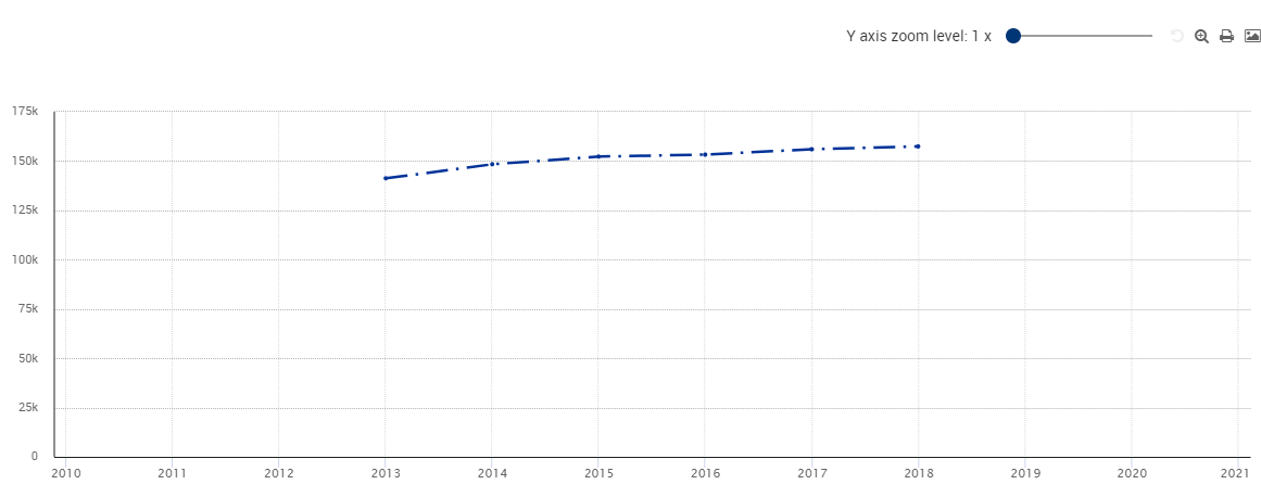
Start from 0 (default value): The chart starts from 0 on the vertical axis
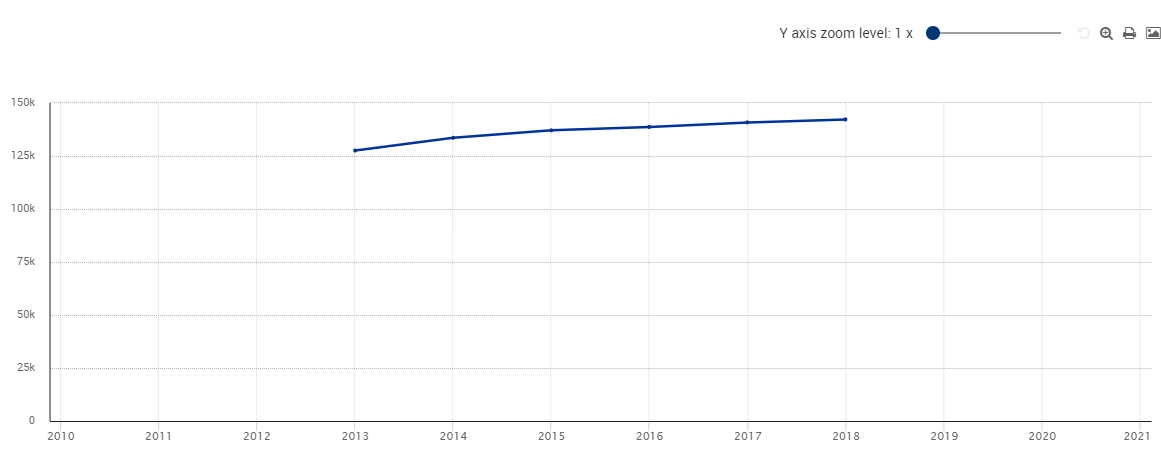
Automatic: The scale of the chart is automatically computed to optimize visualisation
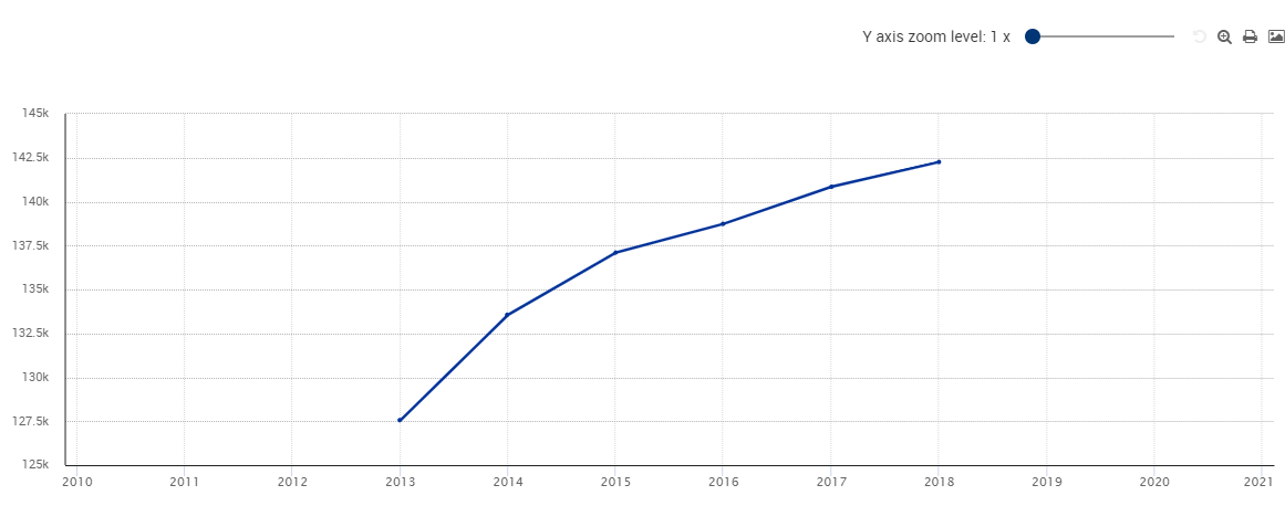
Vertical axis (type)
The available options are:
Linear (by default): The vertical axis is built using a linear scale: it is proportional. In the example below, the difference between each background horizontal line is 10K worth:

Logarithmic: The vertical axis is built using a linear scale: it is not proportional. In the example below, the difference between each background horizontal line grows when getting away from the horizontal axis:

Data displayed
Highlighted
The Highlighted mode allows the chart to display only the positions currently highlighted (from highlighting done by the user in another visualisation or the current line visualisation)
In order to add/remove positions to the chart while in this mode an additional menu is required. This menu is activated by clicking on the brush icon (![]() ). It renders a list showing user current selection of positions. The one currently highlighted and thus visible in the line chart are in bold. A position can be added/removed by clicking on its item in the list. The underlying chart is refreshed automatically to allow the user to preview the change to the chart in term of scale and readability.
). It renders a list showing user current selection of positions. The one currently highlighted and thus visible in the line chart are in bold. A position can be added/removed by clicking on its item in the list. The underlying chart is refreshed automatically to allow the user to preview the change to the chart in term of scale and readability.
In case the line chart visualisation is accessed while there is no highlighted positions, the following rule will apply to ensure a baseline chart is rendered:
In case of a non-GEO dimension, the serie having the highest value of the most recent time period is taken. So the line chart starts with one serie rendered.
For a GEO dimension and in case aggregates are present in the selection, the most relevant EU and EA aggreates are selected. So the line chart starts with two series rendered.
For a GEO dimension and in case no aggregates are present in the selection, again a serie having the highest value of the most recent time period is taken, first among the EU member states or then on the full selection. So the line chart starts with one serie rendered.
Why this rule?
First, the default line chart is made consistent to the line chart displayed in the SDG and me application. So there must be one or two series to render by default.
Second is that a coloured line chart became quickly unreadable with too many lines so this is an invitation to the user to select the relevant series.
Summary
The Summary mode allows the chart to display a summary version of the selected data.
The summary is built on the following principles:
Among the selected positions, the following positions are the only ones displayed in the chart:
Top three lines (lines whose the last value are the three highest statistical data)
Three average middle lines
Bottom three lines (lines whose the last value are the three lowest statistical data)
In this mode, all the other lines are hidden in the chart.
Lines corresponding to positions for which no statistical data is available at all will not be taken into account into this calculation.
To activate this mode, select Summary in the Data Displayed selector.
Example
The Summary mode is not activated in the following screenshot:

The red rectangle shows that 24 positions are selected by the user
The green rectangle shows the 24 lines (except the three positions for which no statistical data is available: Liechtenstein, Norway and Switzerland)
The orange rectangle shows the 24 positions, all of them are (un)selectable to make the corresponding line (dis)appear in the Line chart.
When the Summary mode is activated, the result is the following:
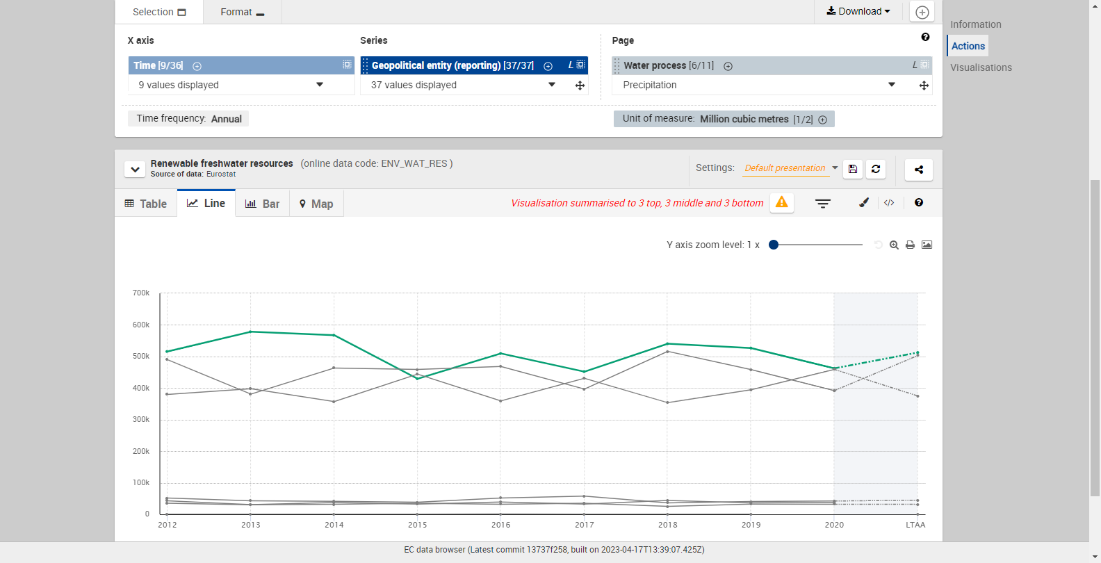
There are still 24 positions selected (red rectangle)
However, only the lines corresponding to the "Top 3 - Middle 3 - Bottom 3" rule exposed above will be displayed. It affects:
The Line chart itself (green rectangle), where all the other lines are masked
The legend under the Line chart (orange rectangle), where only those 9 positions are displayed
A warning message is also displayed (pink rectangle). When clicking on it, or when clicking on the
 button, a modal will be displayed, listing all the positions for which no line is currently displayed:
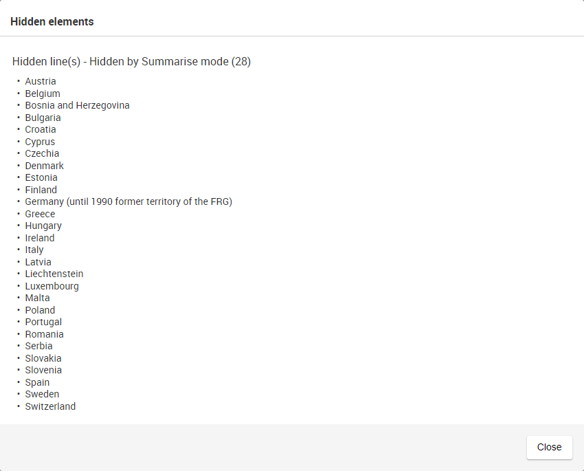
Selected
The Selected mode allows the chart to display all the positions from the selection into the chart.
Lines are either rendered as gray line if they are not selected, or coloured if they are highlighted. Clicking on a line or a legend element allows to highlight or unhighlight it.

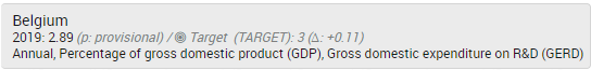
Series Attribute options
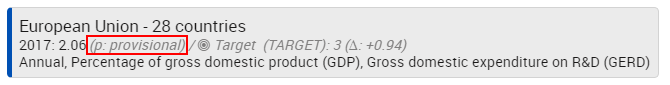
Some datasets contain a Series attribute. It may, for example, represent an objective to be reached in the future (TARGET).
When Show is selected under Series Attribute, the attribute (additional column) is represented in the line tooltip:

Highlight options
In the Line visualisation, it is possible to use the highlight feature (see this page)
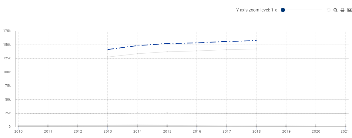
How do the highlighted positions appear in a Line chart?
In the following example, Germany is highlighted:
How do I change the highlight of a position?
There are two possible ways to highlight a position:
Either by left-clicking on the corresponding line on the chart
Either by left-clicking on the corresponding item in the chart legend (under the chart)
To remove the highlight of a position, the same operation must be performed.
The highlighted positions are also reflected in the Table mode:

It is also possible to manage positions what are highlighted and what are not by using the dimension dropdowns (see this page for more information).
How to print a line chart?
To print a line chart, click on ![]() at the top right of the chart.
at the top right of the chart.
Print a line chart with Google Chrome
In the printing dialog, click on More settings (at the bottom of the left pane).
Then use the Scale field to adjust the size of the printed line chart:
A higher value of scale will make the line chart appear wider on the printed page; however it may also require more sheets for printing. This is the best choice to make if getting a large line chart is required.
A lower value of scale will make the line chart appear smaller on the printed page. This is the best choice when printing the whole chart on one single sheet is required.
Print a line chart with Mozilla Firefox
There is no specific printing options available under Mozilla Firefox.
Print a line chart with Microsoft Edge
In the print dialog:
If printing the chart in portrait format is necessary, use the following settings:
Orientation: Portrait
Scale: Shrink to fit
If printing the chart in landscape format is necessary, use the following settings:
Orientation: Landscape
Scale: 100%
Print a line chart with Internet Explorer
There is no specific printing options available under Internet Explorer