Data visualisation
Click on Map tab to visualise the data with a map:
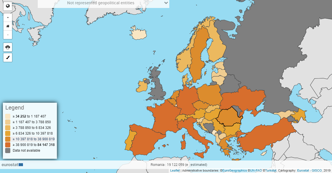
![]()
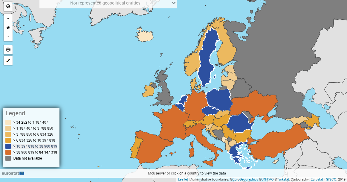
The interactive map provides an overview of the geographical areas for the selected dataset.
Dimensions Management
The Geographical area dimension must contain the "Geopolitical entity" dimension
The Series dimension is available above the visualisation, at the top left. Select your position (ex: TIME = 2014): the map will be adapted to the newly selected position
If available, select the appropriate geographical level (at the top right of the map):

Country level: map is at the national level
NUTS 1 to NUTS 3 Levels: the map is at the regional level based on the NUTS classification (see this page for more information about NUTS classification)
The value of the observation will drive the colour affected to each of the geographical areas displayed. In the colour legend:
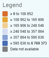
Values are grouped into classes, based on the classification method selected in the Format tab
Dark grey is used when no data is available
Light grey is used for geographical areas out of the scope.
Map-specific features
Some geographical entities are incompatible with the Map component. When this is the case, the Not represented geopolitical entities dropdown will list those entities and the data linked to it:
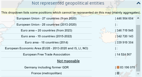
Such entities are:
Aggregates (ex: EU27_2020)
NUTS entities related to a version of NUTS which is not the last (implemented) version of NUTS. So, for example, data related to 2010 version of NUTS won’t be displayable on the 2013 version of the NUTS Map component.
Display overseas regions by clicking on the globe in the upper middle area of the map. Click again to hide once showed:

Using the mouse wheel, it is possible to zoom in and out in the map
Mouse hover a geographical area to display, at the bottom of the map, the name of the geographical area, the observation value and potential flag:
Click on any geographical area. A table is displayed allowing to compare the observation values between the selected geographical area and other geographical areas, grouped by classes.
Close the table with the close icon located in the upper right area of the table.
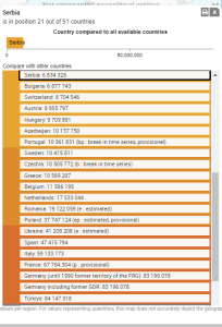
To move the map in any direction, left-click on the map, keep the mouse button pushed, move the mouse in the desired direction, then release the mouse button
Click on a class in the legend to highlight in blue all geographical entities belonging to that class:
When the dataset refers to NUTS-related data, and if a NUTS level (NUTS 1, NUTS 2 or NUTS 3) is currently selected, an additional dropdown list appears under the NUTS level selector:

Using this dropdown list, you can select the version of the NUTS to be used in the map. By default, the most recent version of the NUTS is selected. For more information on NUTS versions, see this page).
If you select only Aggregates positions in the Geographical dimension, the Map visualisation won’t be able to render itself. In this case, the following message may appear: Data cannot be viewed on a map. Geographical entities are not selected or cannot be represented. Please go to selection or modify filter.
If this message appears, select at least one non-aggregate (Country, NUTS 1, NUTS 2 or NUTS 3) position to display the map and remove the error message.
Format options
Click on Format (in the Actions area) to set the different format options of the map.

Labelling options, Decimal symbol options and Thousands symbol options are described on this page.
Flags options
Show (default value): When hovering a geographical area, flags are shown in the tooltip under the map:

Hide: Flags are hidden:

Classification method
This provides information about the map classification for the currently displayed map (Quantile in the provided example):
Quantile: Each interval contains the same amount of observations
Equal intervals: Each interval has the same size
Custom intervals: Each interval’s size limits are customizable by dragging the cursor to the desired value. Alternatively, you can set the new limits in the popup which is displayed when clicking on one of the limit points:
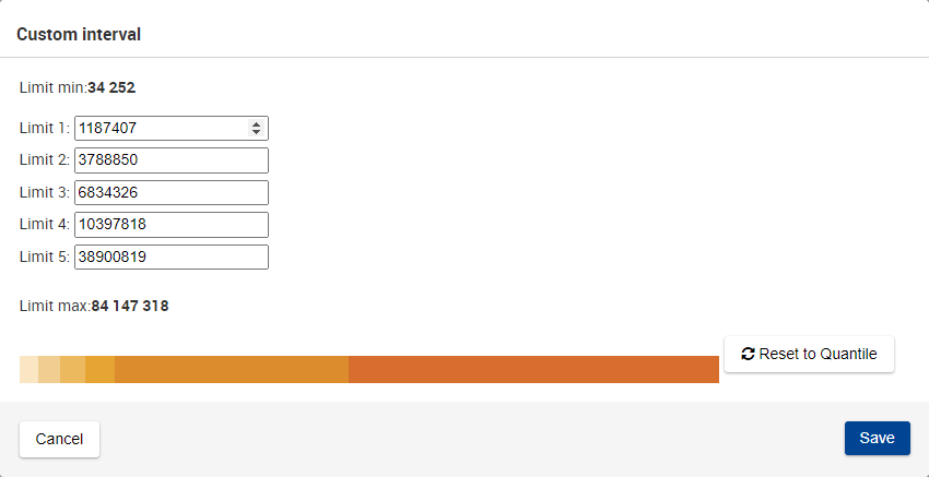
When first accessing this window, the default limit values are the ones defined in Quantile.
When setting new limits, in case there are more than 1, they cannot be lower than the previous or greater than the next. Otherwise, an error is displayed:
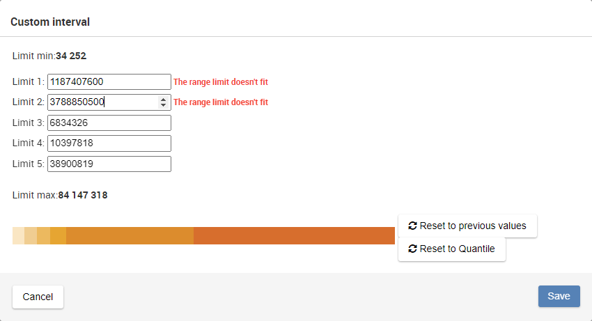
In case the value limits have been previously modified, a new button is available, which will set the values to the previous ones:
Or alternatively, you can set the default quantile values by clicking on
 button.
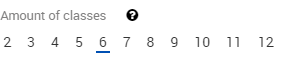
Amount of classes
Amount of classes sets the amount of classes to be used, with a minimum of two and a maximum of twelve.
Series attributes options
Some datasets contain a series attribute. This attribute provides additional information, like:
TARGET: Objective to reach
LTAA: Long-Term Annual Average
When displaying such dataset in a Map, the series attribute will be visible in the tooltip, placed at the bottom of the map, which is displayed each time the user moves the mouse over a geographical area. Example:

Show data options
By default, the Data Browser displays the data in Map corresponding to the currently selected position in the selector above the Map:

However, the "Show data" selector provides to the user another way to manage the situation where a statistical data is missing for a specific position (for example, a specific year):

The available options are:
Selected data (default value): the Map will only display the data related to the position selected in the selector above the Map
Complete with previous: if possible, the Map will display the data related to the position selected in the selector above the Map. If no data is available, previous data will be used (see example below)
This selector is not available if there is no Time dimension in the dataset
Example
The example is based on the following settings:
Dimensions layout:

Selected year (in the selector above the Map): 2019
Show data selector is set to Complete with previous

The Map will display, for each selected Geopolitical entity position (= each geographical area in the map):
If statistical data is found for 2019: when hovering (with the mouse cursor) on the geographical area, the tooltip under the Map will be the following:

If statistical data is not found for 2019:
Either statistical data, for this position, is available before 2019 (among the positions selected by the user in the Series dimension). In this case, when hovering (with the mouse cursor) on the geographical area, the tooltip under the Map will also mention the previous time position to which the represented statistical data is referring (2018 in the example):

In this case, there was no statistical data available for Bosnia and Herzegovina in 2019, but there was statistical data available in 2018.
In this case, a warning message appears above the Map: "Warning! The chart currently displays data related to more than one time period! Click here to see the list of exceptions". Clicking on this message displays a modal which lists all the positions for which previous data was used.
Either statistical data, for this position, is not even available before 2014 (among the positions selected by the user in the Series dimension). In this case, the geographical area will have a gray background, and the tooltip (which appears when hovering with the mouse cursor on the geographical area) will be:

Print maps
Depending on the web browser used, it may be necessary to fine-tune some settings (see below).
Once these settings are set (if applicable), printing map is triggered when clicking on ![]()
Select then a perspective: ![]()
For best printing results, please refer to the user manual of your browser and your printer.